

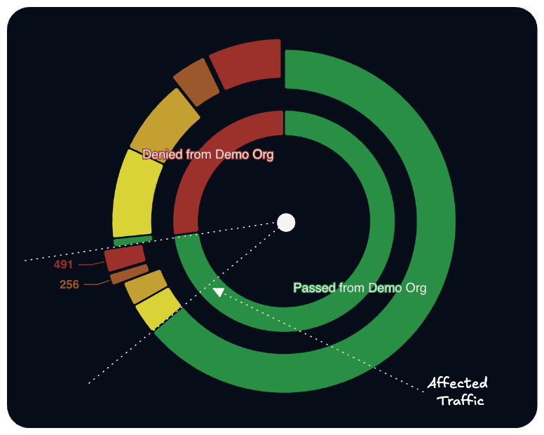
Denied traffic is not automatically the right traffic
Demo Org’s existing rule set (geo-blocks, rate limits, static lists) was already stopping a measurable volume of traffic before OneFirewall was introduced. “Denied” and “denied because it was dangerous” are separate claims, however. The inner ring color-codes the denied segment by severity, and the callout marked Affected Traffic, pointing at 491 and 256 events, marks the boundary between what the existing rules caught and what fell just outside that boundary.Where the discrepancy originates
A gap analysis compares total volume blocked against volume that should have been blocked based on current scoring. A rule set built on static entries doesn’t have visibility into an indicator that nineteen independent Alliance members scored Critical an hour earlier. It only enforces what was configured into it at some earlier point. The affected traffic segment in this chart represents that lag: scored, corroborated activity the existing perimeter had no mechanism to recognize at enforcement time.Baseline before change
This chart is typically the first output in an engagement because it establishes a baseline using traffic the organization already logs, without requiring a change to existing firewall configuration. It quantifies what current rules catch and what they don’t, using the same data source the organization already has.Proof of Value engagements produce this same breakdown against a client’s own firewall logs. Start a Proof of Value.